Animate a Side Drawer with LiveView.JS
Welcome back to another blog post!
Before we begin, one question:
When a building goes to a party, what does it wear?


Address!
Alright. Yesterday, I tweeted about my struggles to animate a side drawer in LiveView. You folks asked me to write about it, so here's a quick dive into how to animate a side drawer using Phoenix.LiveView.JS
The Setup
Our setup is pretty simple: We have a full-width div element that shows our content and a side drawer on the left side. We want to show and hide the drawer using some icons. Here's the code without any show/hide functionality. For brevity, I removed any CSS classes that are not relevant to the show/hide logic.
<div id="container">
  <div id="drawer">
    <div id="drawer-content" class="w-60" />
  </div>
  <div id="content" />
</div>
Our goal is to add two buttons that show and hide the side drawer. Let's get started.
Without Transition
The easiest option for showing and hiding the drawer is to add two buttons and add the JS.show/1 and JS.hide/1 calls as a phx-click to them. Here's the full code:
<div id="container" class="relative">
  <div id="drawer" class="z-10 absolute">
    <div id="drawer-content" class="w-60">
      <button phx-click={JS.hide(to: "#drawer")}>
        <.icon name="hero-arrow-left" />
      </button>
    </div>
  </div>
  <div id="content">
    <button phx-click={JS.show(to: "#drawer", display: "flex")}>
      <.icon name="hero-arrow-right" />
    </button>
  </div>
</div>
Let's walk through the CSS and Elixir code here. The first important change to our setup is to give the side drawer an absolute-position with a z-10 index. This means that the side drawer will open "over" our content and our content div won't resize. You can leave this out if you prefer to resize your content, but be aware that this might squeeze your content too much in mobile views.
Two more things to note: We gave our container-element the relative-position so that the absolute-drawer positions itself relative to the container element. In practice, this means that the drawer will never extend beyond the container element.
Next, we used button-elements to wrap our icons. This is important for accessibility reasons because you can select and press the buttons using a keyboard whereas our icon span-elements are not (easily) selectable or clickable. You can try it yourself by simply hitting tab when you open the page. After one or two tabs, you have the open or hide button selected. If you press space or enter, it will open or close the drawer.
Lastly, we want our drawer to have display: flex when we show it. LiveView adds the display: block class by default, so we need to overwrite the default using the display: "flex" option.
And that's it. If you click the buttons, the side drawer will open and close. Yey! This is what it looks like:
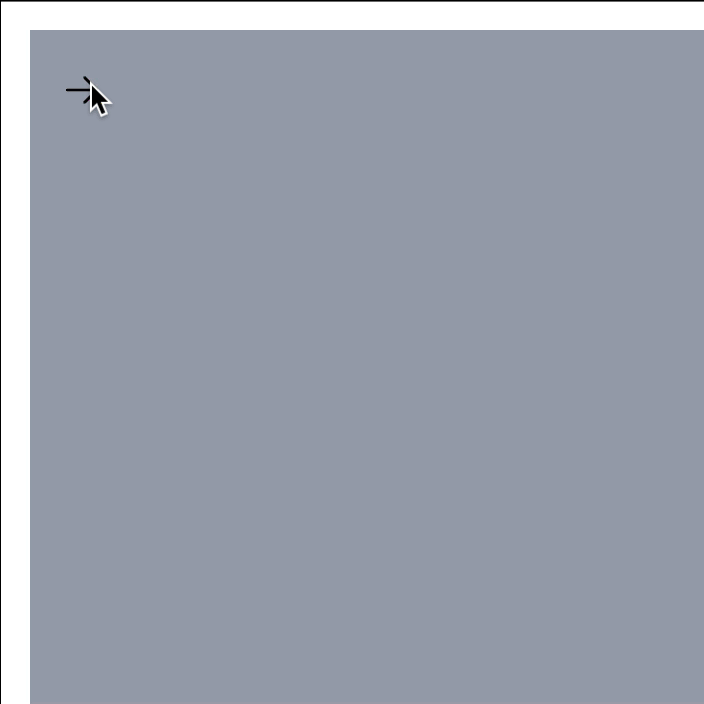
As you can see, the "transition" is rather abrupt. Let's add some smooth transitions next.
With Transition
We can add our transitions directly to the JS.show and JS.hide calls. Both of them have a transition-option which allows us to set 1) the transition class, 2) the start class and 3) the end class of the transition. To be honest, I don't know what any of this means, but it works, so I won't complain.
We could add the transitions to our HEEX template directly, but to keep our template clean, let's create two helper functions in either our core_components.ex file or the file of our LiveView. Here's what the helper functions look like:
# core_components.ex or your LiveView file
def show_drawer(selector, display \\ "block") do
  JS.show(%JS{},
    to: selector,
    display: display,
    transition: {"ease-out duration-150", "-translate-x-full", "translate-x-0"},
    time: 150
  )
end

def hide_drawer(selector) do
  JS.hide(%JS{},
    to: selector,
    transition: {"ease-in duration-150", "translate-x-0", "-translate-x-full"},
    time: 150
  )
end
The functions call the same JS.show/2 and JS.hide/2 as our buttons did, but they add a transition option.
The first parameter of the transition option is the transition class that is added to the element before the transition begins. In our case, we added the ease-in|ease-out duration-150 classes. The ease-in|ease-out class is the transition-timing-function. You can read more about these functions here. The second class that we add is the duration-150-class. It defines the duration of the transition. You can change it to e.g. duration-300 and will see that the transition takes twice as long. Make sure to set the time-option to the same duration value. Otherwise, LiveView will remove your transition class before the transition has been completed and the transition becomes choppy.
The second and third parameters hold the start and end transition class. My understanding is that these classes define the start and end state of the element. For example, if we show the element, we transition from transform: translateX(-100%) to transform: translateX(0). CSS needs these start and end classes to calculate the frames between the start and end state. Again, please consult this blog post which explains it much better than I ever could.
Now, let's replace our phx-click-attributes with the new helper functions:
<div id="container" class="relative">
  <div id="drawer" class="z-10 absolute">
    <div id="drawer-content" class="w-60">
      <button phx-click={hide_drawer("#drawer")}>
        <.icon name="hero-arrow-left" />
      </button>
    </div>
  </div>
  <div id="content">
    <button phx-click={show_drawer("#drawer", "flex")}>
      <.icon name="hero-arrow-right" />
    </button>
  </div>
</div>
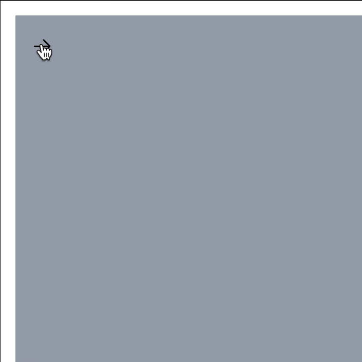
And with the transitions in place, this is what it looks like:
Toggle the Drawer
If you prefer to have one button that shows and hides the drawer, you can use the JS.toggle/2 function instead. Here's another helper function that uses the function instead of the JS.show/2 and JS.hide/2 functions.
def toggle_drawer(selector, display) do
  JS.toggle(%JS{},
    to: selector,
    in: {"ease-out duration-150", "-translate-x-full", "translate-x-0"},
    out: {"ease-in duration-150", "translate-x-0", "-translate-x-full"},
    display: display,
    time: 150
  )
end
And here's the HEEX template with a single button that toggles the drawer:
<div id="container" class="relative">
  <div id="drawer" class="z-10 absolute">
    <div id="drawer-content" class="w-60" />
  </div>
  <div id="content">
    <button phx-click={toggle_drawer("#drawer", "flex")}>
      <.icon name="hero-arrows-right-left" />
    </button>
  </div>
</div>
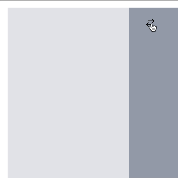
This is how the transition looks like with a single button:
Conclusion
And that's it! I hope you enjoyed this article! If you want to support me, you can buy my book or video course. Follow me on BlueSky or subscribe to my newsletter below if you want to get notified when I publish the next blog post. Until the next time! Cheerio 👋